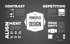
There students of design and architecture frequently suffer from this basic tiff – what is concept and meaning in design? And what does meaning really has to do with aesthetics and design? There are various ways to explain this idea but here I am only going to explain it from a very visual point of view, limiting the explanation to shapes and forms.
May it be colours, sounds or shapes, human mind is intrinsically trained to perceive, analyze and ‘understand’ what it is subjected it. Colours and differentiated and ‘distincted’ and an image is formed. If it is music, various single or overlapping sounds are perceived. Patterns and rhythms are identified and ‘understood’. I hope I am being able to make it clear here what I mean by ‘indentified’ and ‘understood’. If there is a pattern, a rhythm being followed, our brain and identify it, follow it and in turn, enjoy it. If you listen to any piece of music, may it be pop, rock or classical, you would notice this idea. (A good study or demonstration would be to pick up any song and listen to it keeping these points in mind, trying to ‘identify’ the music.)
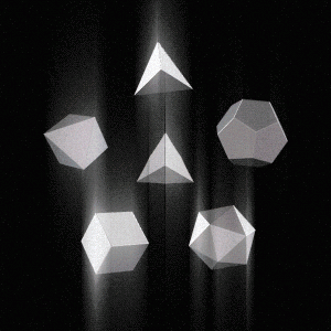
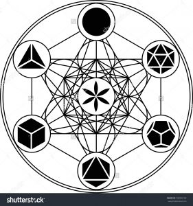
When it comes to shapes and forms, which is directly related to architecture and design, the mind follows a similar pattern of ‘understanding’ the ‘meaning’ of the form. (Please note that we are not discussion the philosophical ideas of the relationship of form and meaning here. That would be a completely different discussion.) Humans are primarily visual beings. We see and identify before we hear and understand. Whether formally trained to understand geometry or not, human mind, with its exposure to the physical environment, analyzes, understands and identifies shapes and forms – triangular – similar to the shape of a mountain, circular – similar to the shape of the sun, linear – similar to the shape of the trunk of a tree and so on. Now whenever an architect or a designer (or even an artist creating a painting or a sculpture) creates an object or a building, the human brain automatically, instinctively, starts to analyze, identify and understand it i.e. forms, shapes and proportions and identified and understood. And once that shape is ‘understood’ by the brain, it starts to make sense to it because it can identify those shapes – the shapes mean something to the brain. If the brain can not identify the shapes and the proportions of a form, it does not have meaning for the brain and therefore the form begins to appear strange or unpleasant. This, I believe, is the main reason why so many times teachers trash students’ work and in sheer irritation call it trash, garbage, useless, ugly or in our local dialect here, call it ‘totally tatti’. So when you sit down to design a form next time, I am sure you will be able to design a more aesthetically pleasing form if you keep these ideas in mind.
Before I sign off, I must mention and you, as a student, must never limit yourself with this idea and follow it blindly. Along with ‘indentifying’ and ‘understanding’, human mind is also trained to evolve. Just like we enjoy listening and seeing harmony and rhythm, humans also enjoy learning. If we are always subjected to stimuli which will always give us successful identifications and predictions, then these identifications and predictions that come so easily will not really give us any pleasure but will only appear boring. Therefore, subjecting the brain to ‘novelty’, exposing it to new forms and patterns must also be encouraged. Otherwise how would Fran O’ Gehry and Santiago Calatrava have ever created the marvels they did.
This blog entry has been written for Mind Rain by Rahul Saini. To know more about him you can visit his website www.rahulsain.in https://en.wikipedia.org/wiki/Rahul_Saini